Kickoff
Framing the unified goal and focus areas
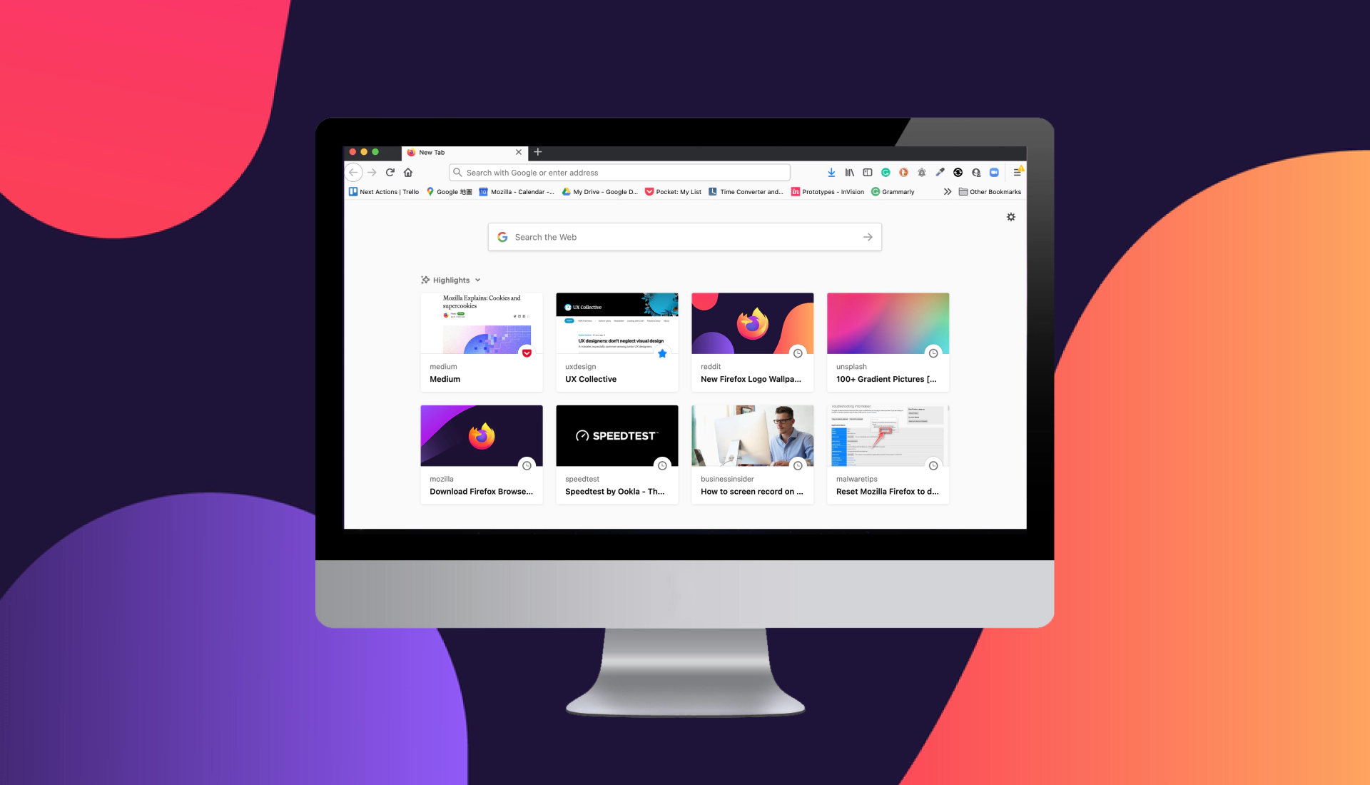
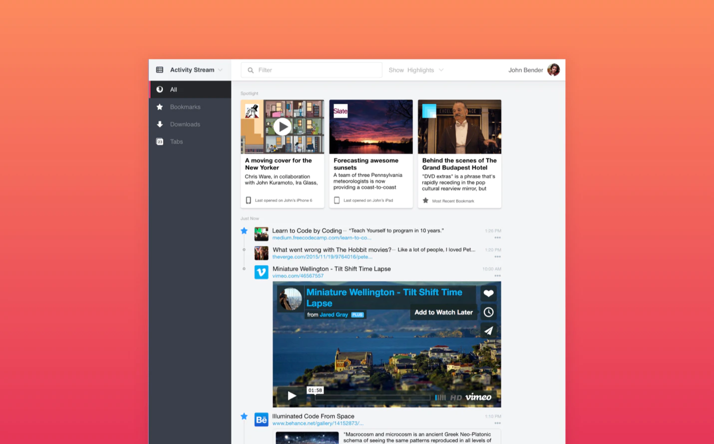
We first sat down with key design stakeholders to discuss our vision and plan for the redesign. Our workstream focuses on two common asset types that the user encounter most - bookmark and download and defined a few guidelines to ensure we sprint toward the same experience.
Simplify the web library to make it more integrated and useful.
Unlock other touchpoints to help people to find their web assets.
Making the interaction more personal and contextual.
Research
Study the best practice of modern browsers
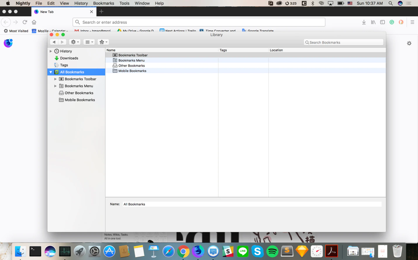
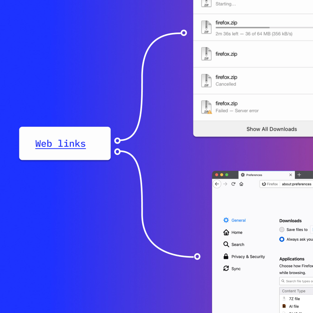
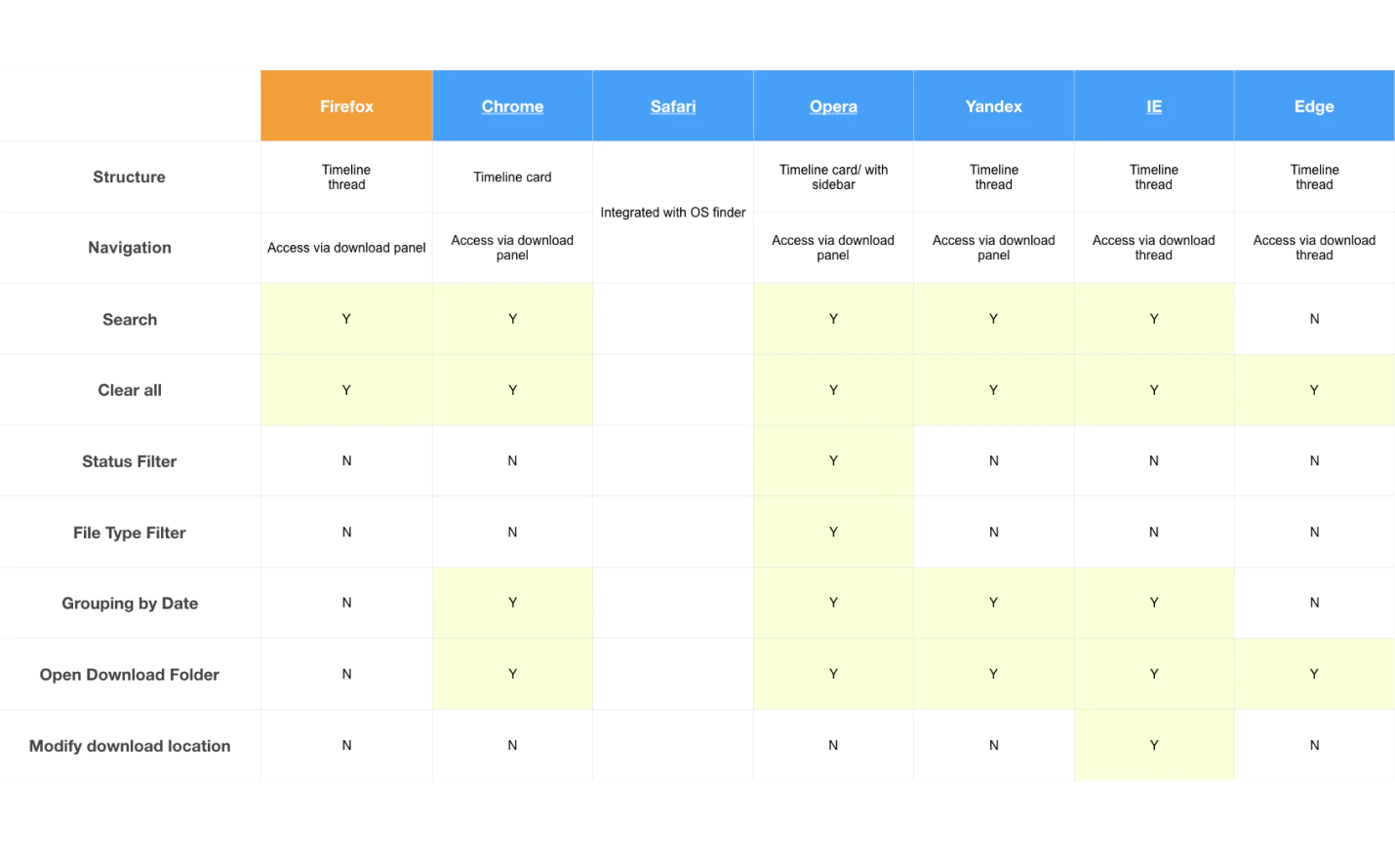
To better position ourselves and not reinvent the wheels, we compared library features from the mainstream browsers to identify gaps and potential opportunities to improve the experience. Findings revealed a couple of shortfalls of the current Firefox library:
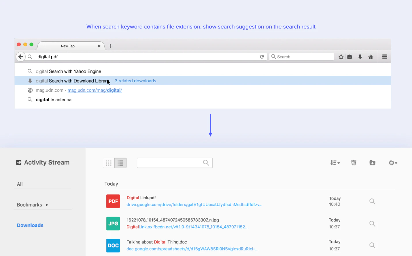
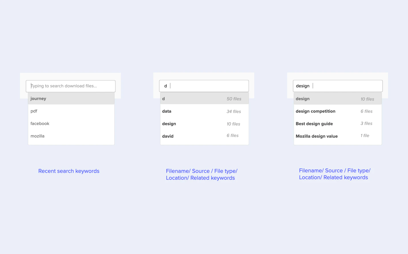
There is no easy way to retrieve assets in the library quickly.
The library fails to show assets in a clear order.
Some key actions are hidden in the context menu.
Design
Mental model and behaviors on content revisiting
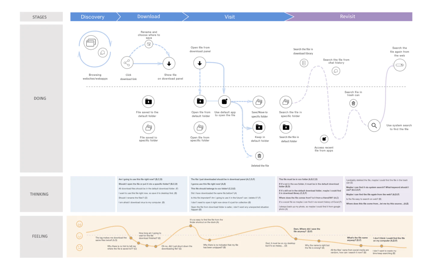
To dive deeper into the user's mental model of content revisiting, we invited people with various tech-savviness and browsing habits to the workshops. We set up exercises to understand their behaviors and what tools they use related to content revisiting. We then mapped out a journey map to show the ups and downs of the experience, and design opportunities for us to move on.
Stay organized is tedious, especially for proper naming and categorizing.
Search is vital, especially for people who have inconsistent saving behaviors.
Visual and spatial cues are more effective for people to retrieve the memory.

Design
Identify the key touchpoints along the revisiting journey
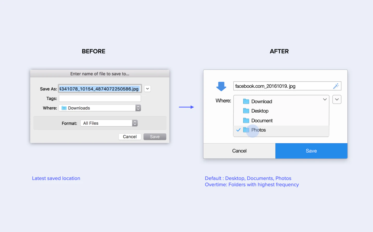
Since there are many touchpoints that can impact the content revisiting experience, we decide to find the hot spots first to focus our design efforts on. To do that, we explore early ideas based on the findings from the previous workshop and invite the same user group to review the design. The vote and feedback reveal two key moments that people might need help most - Saving content and library managing.
Testing
Connect the experience with other design teams
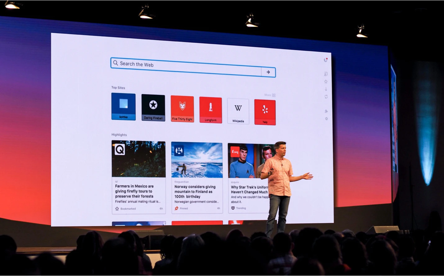
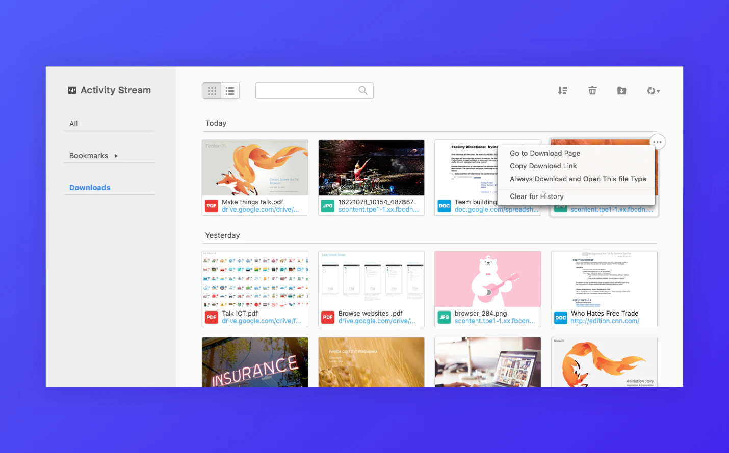
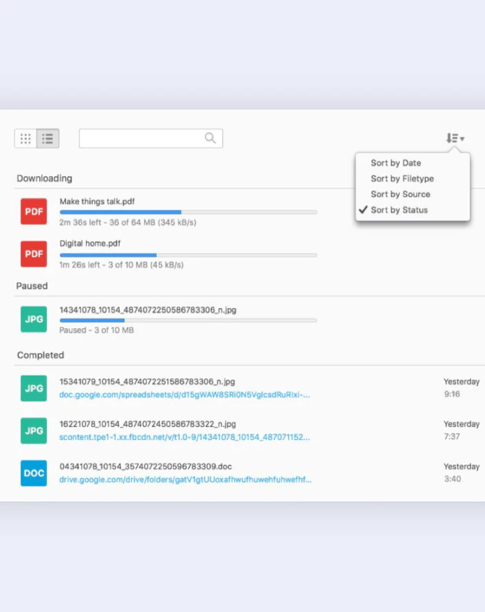
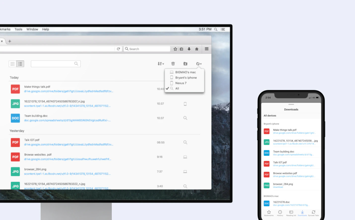
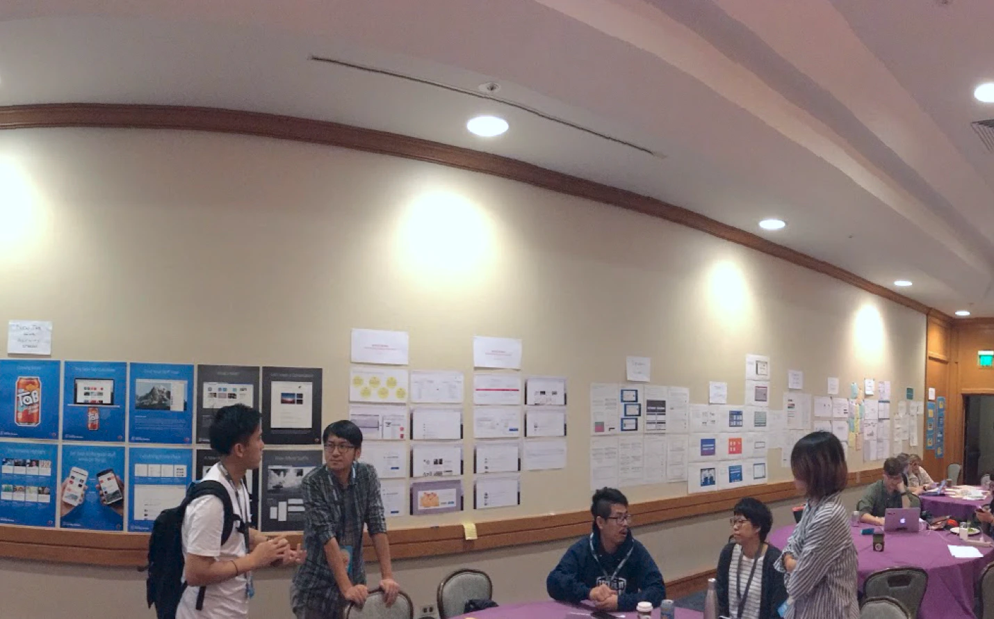
To make sure we connect well with other design tracks under Activity streams, we turn the ideas into a mockup to collect feedback from others in an open design critique in Mozilla's yearly All hands. Together, we evaluate user value and development cost, and vote as a team to select three hero concepts for further testing: bookmark bar thumbnail, library list/grid view, and the sorting system for downloads.
Testing
Testing the prototype with the end user
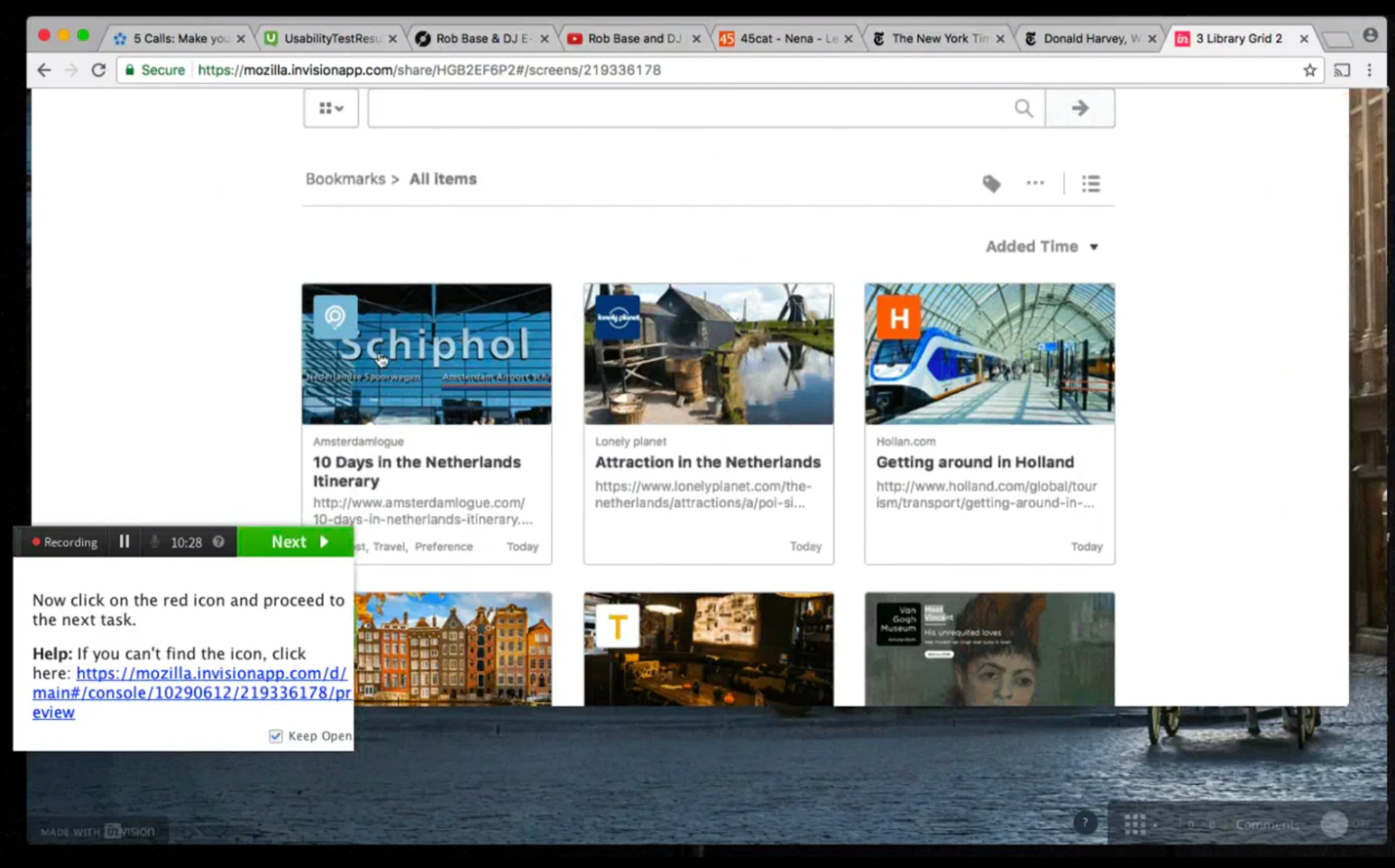
With the selected idea and feedback, we build a high-fidelity prototype and conduct the un-moderated test remotely on user testing.com. We wrote different scenarios to mimic the actual experience and tested them with 10 people of mixed ages, gender, and locale from North America. Finding reveals positive sentiment and a few improvements to move on.
Participants liked the library to be on a new tab page instead of a separate window.
Participants found the preview image and filter are handy and intuitive.
Participants thought the download library is a bit redundant as it can replace by the OS finder.
