Research
Empathizing user scenarios and needs
Without the health profession's presence, we need to make sure anyone can use the system even with no technical know-how and poor health condition. With limited access to our users, we interviewed people with a similar profile, built the hypothetical persona and user journey based on the guidelines. As the insights unfold, a few needs are clear for the team to address on
Make the system easy and fast since people might use it under severe pain
The system should be compact and comfortable so people can wear it for a long time.
The test should easily pause and resume to fit people's busy schedule.

Research
Learning diagnostic know-how from the best practice
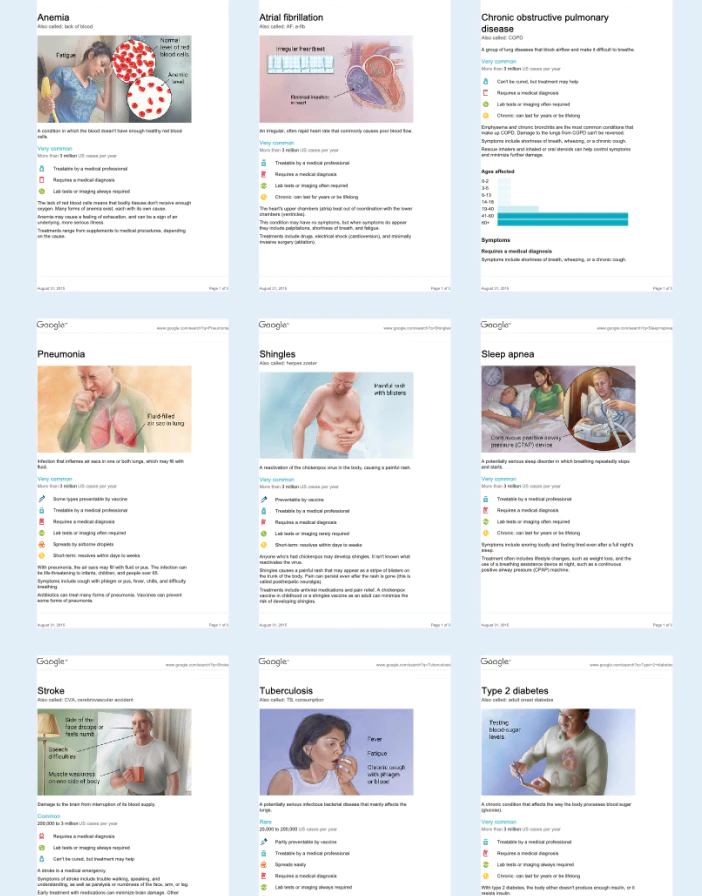
To build a robust diagnostic system, we partnered with two top medical centers in Taiwan (NTUH and CGH) to tackle the different diseases. We interviewed doctors to learn about each condition while observing how they applied the treatment in the field. We also worked with Dr. Andrew from MGH to study how to use triage to boost diagnostic speed and avoid unnecessary tests.
Research
Explore emerging technology with research labs
To fit the system into the 5-pound limitation, we collaborated with the leading research labs (NTU, NCU, NTHU, NCKU) in Taiwan to explore possible technology to reduce the weight. We then evaluated the trade-offs with engineers, tested the experience and effectiveness with proof of concept, and identified a set of candidates as the system's final building blocks.
Design
Defining the diagnose strategy and approach
With a holistic understanding of users, diseases, and technology, we are ready to build the system from the ground up. We first identify a high-level diagnostic flow then dive into the diagnostic approach for each disease.
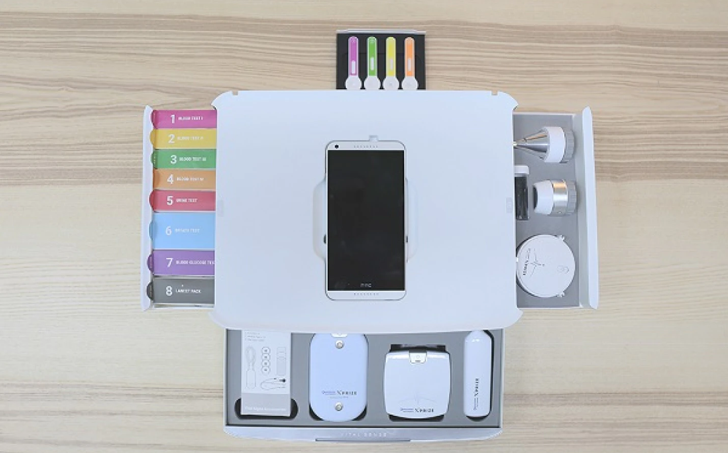
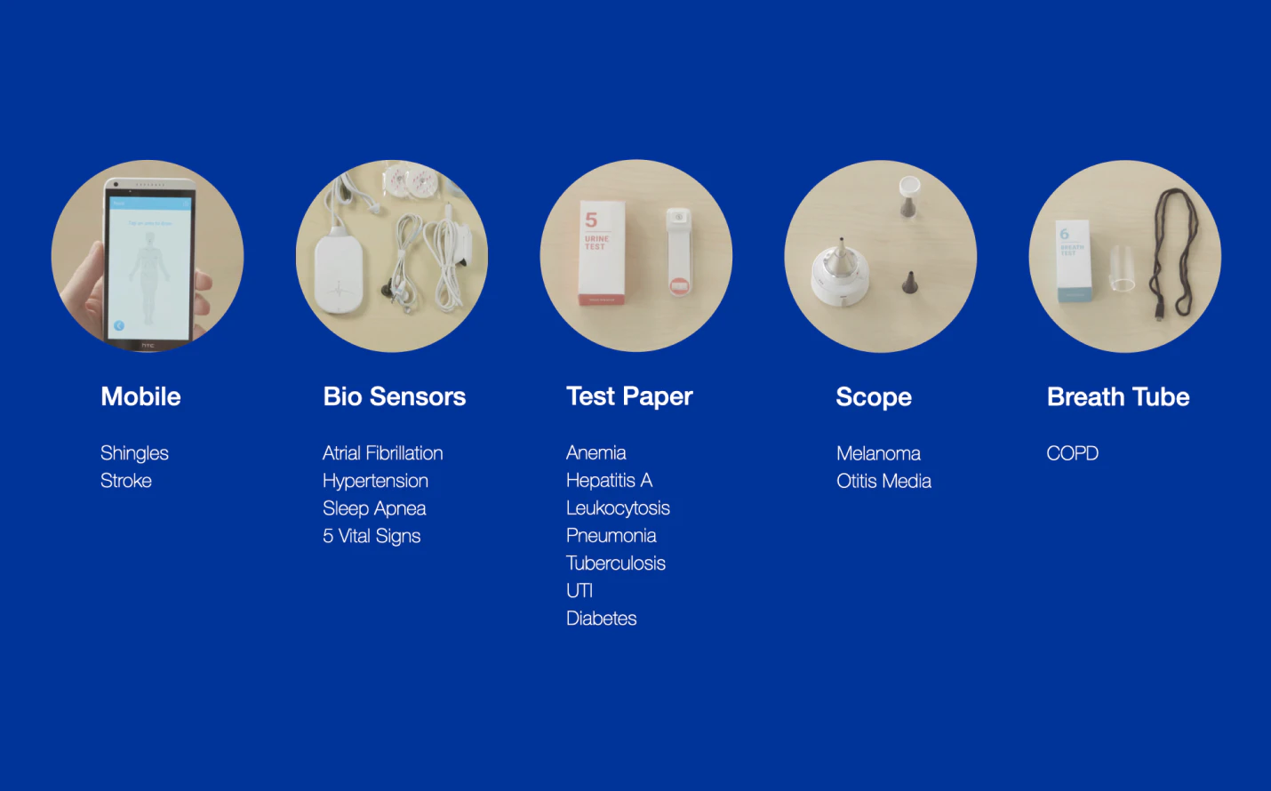
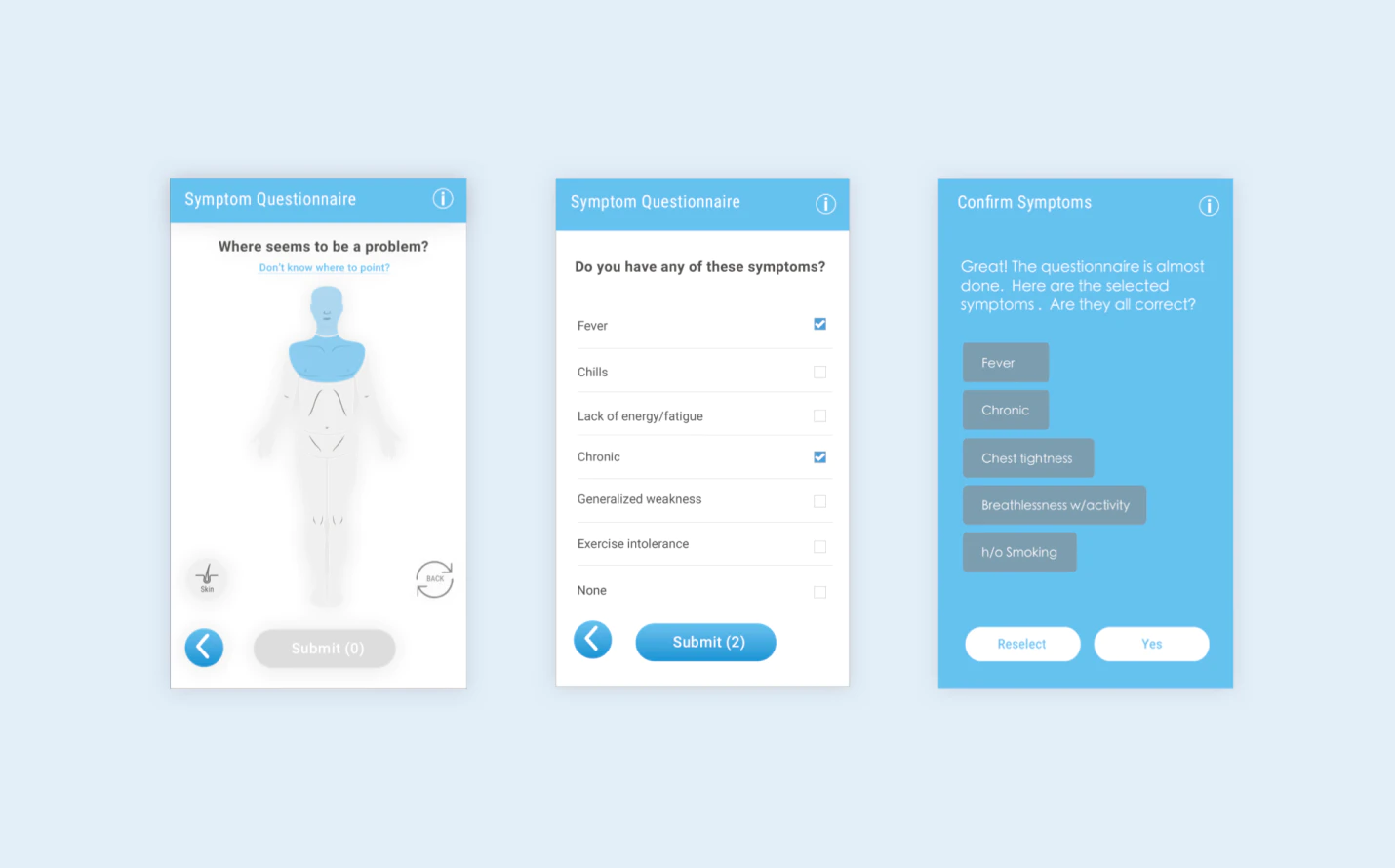
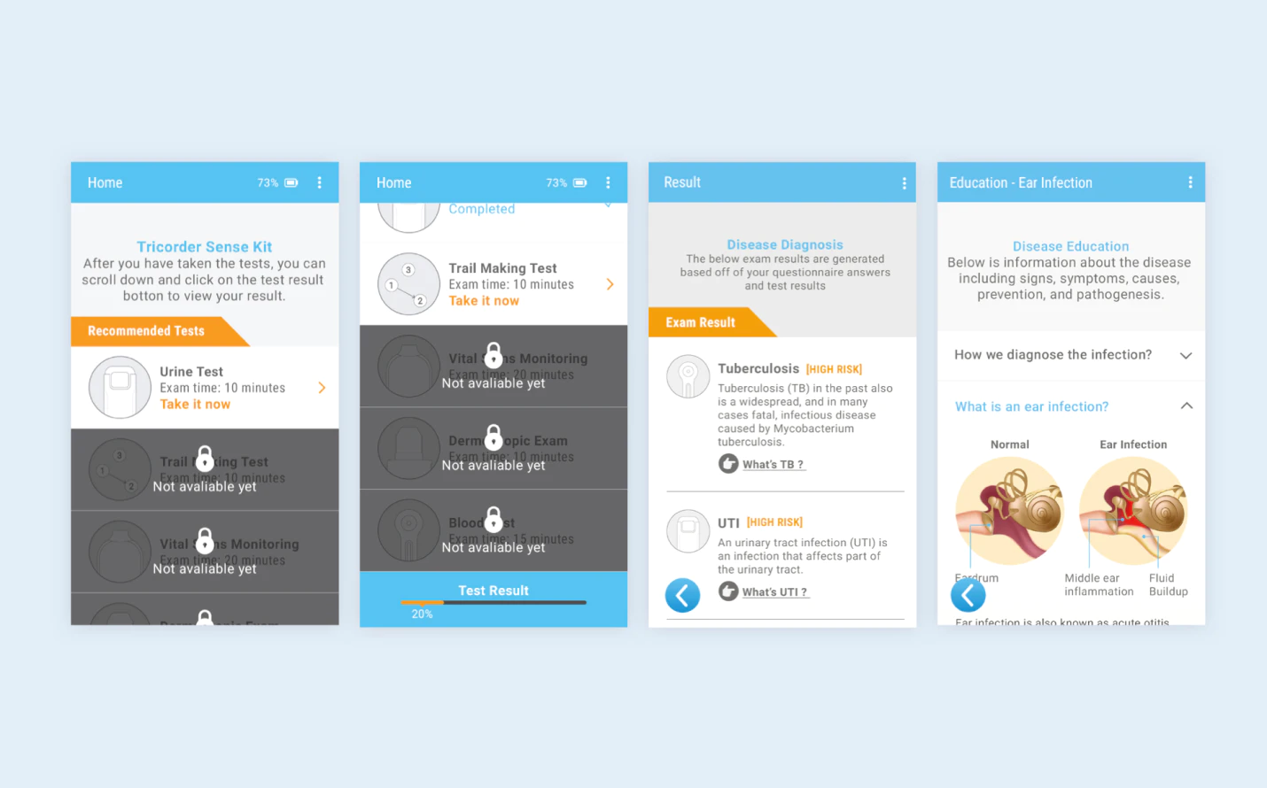
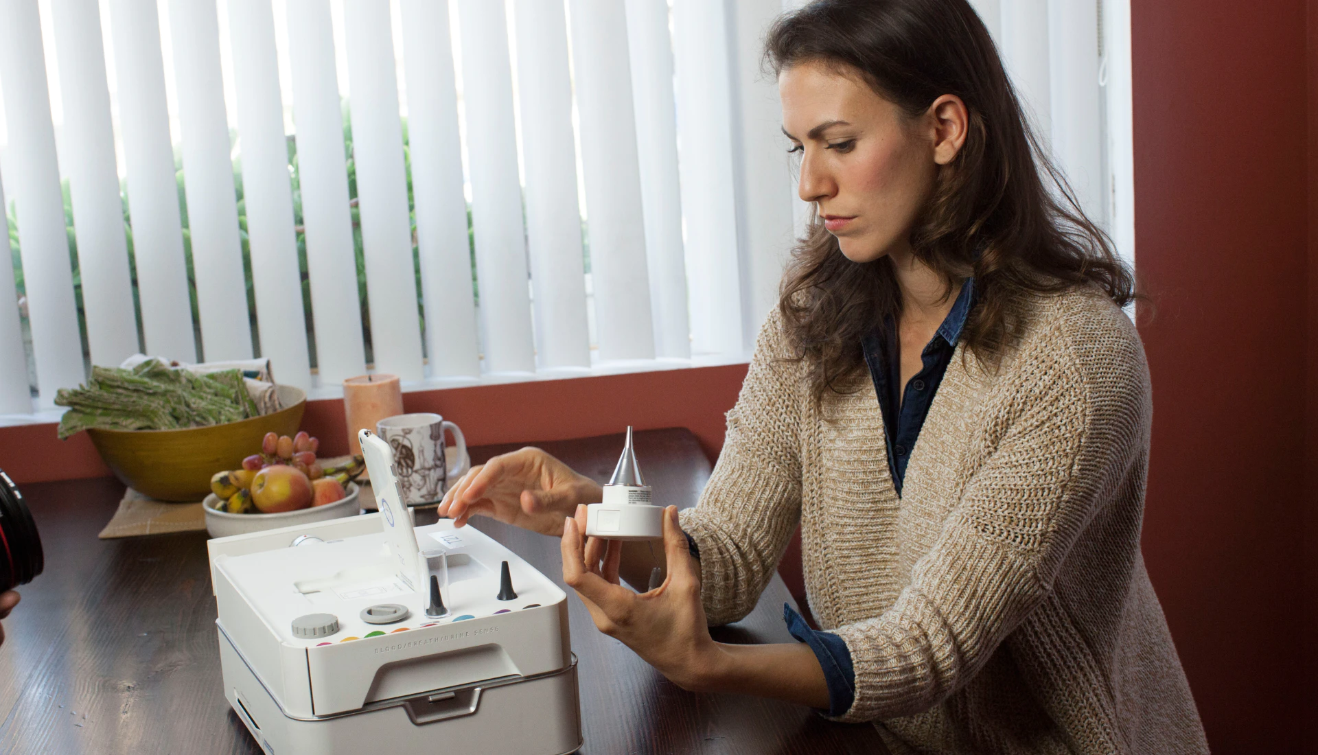
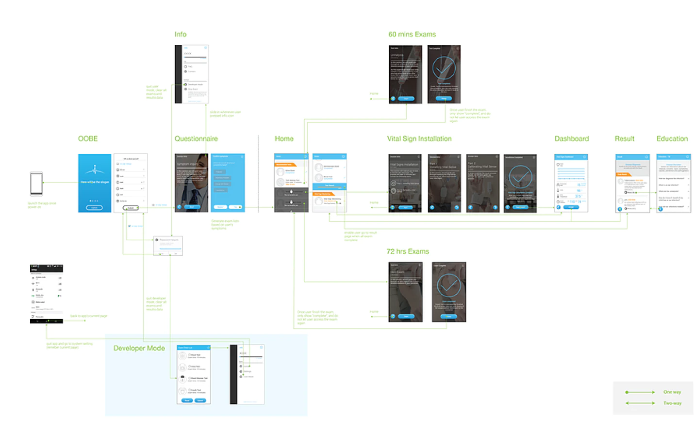
Considering all the limitations, we decide to use mobile as a central agent to guide the user through the diagnostic journey and connect it with four gadgets to collect the necessary biomarkers (ex. blood).
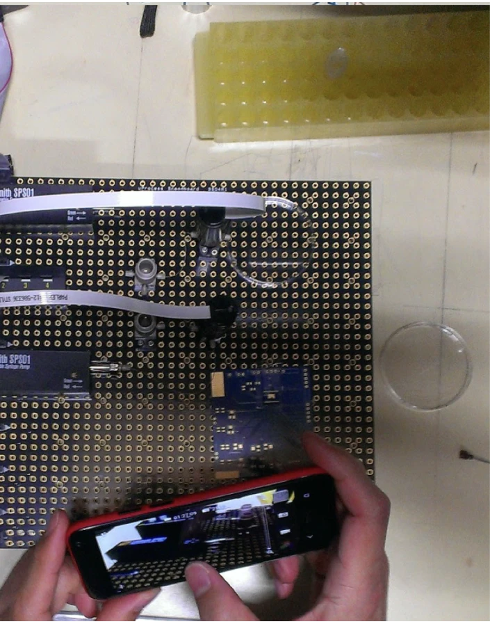
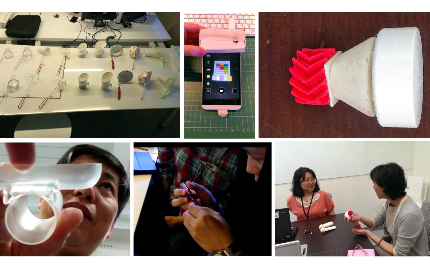
Design
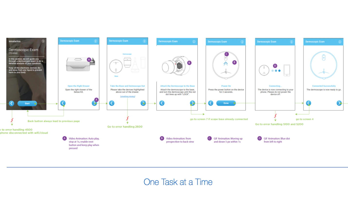
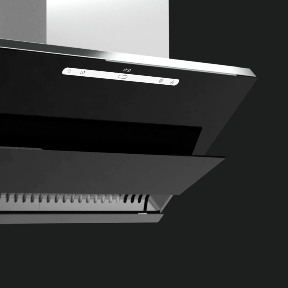
Gadget: do what the mobile can't do
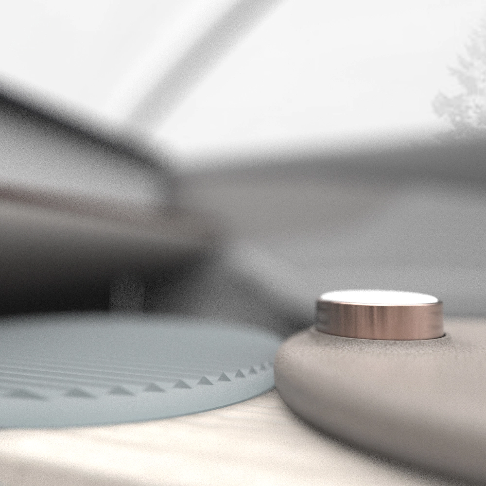
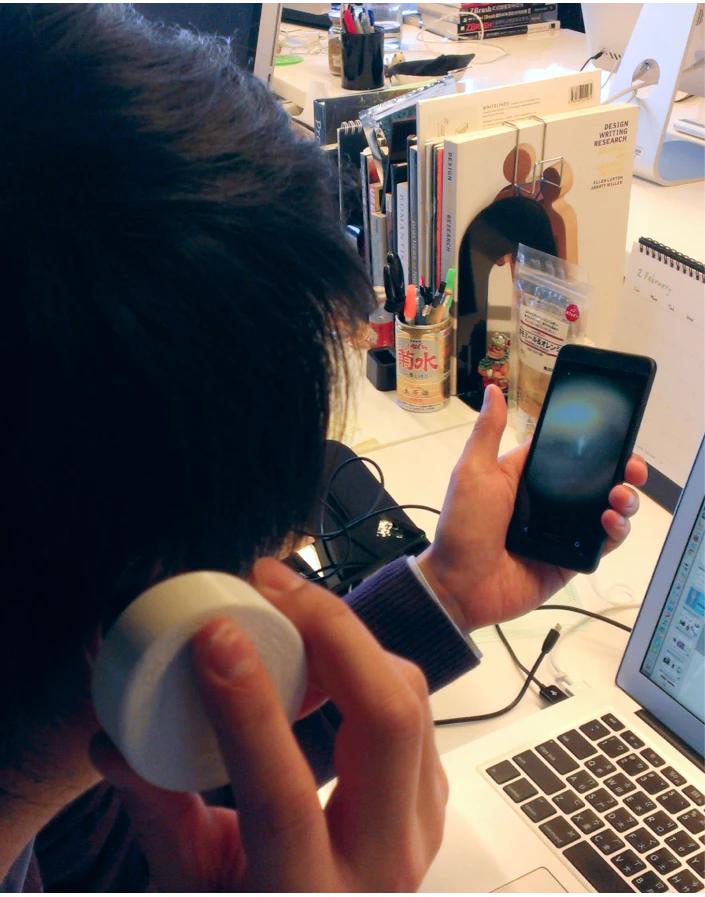
The 5-pound limitation and development cost force us to leave the gadgets with essential parts that mobile can not replace, such as high-resolution camera and electrical probe. With the engineer's help, we built prototypes in various fidelities to explore the form factor until a design emerged that balances usability, feasibility, and aesthetics.
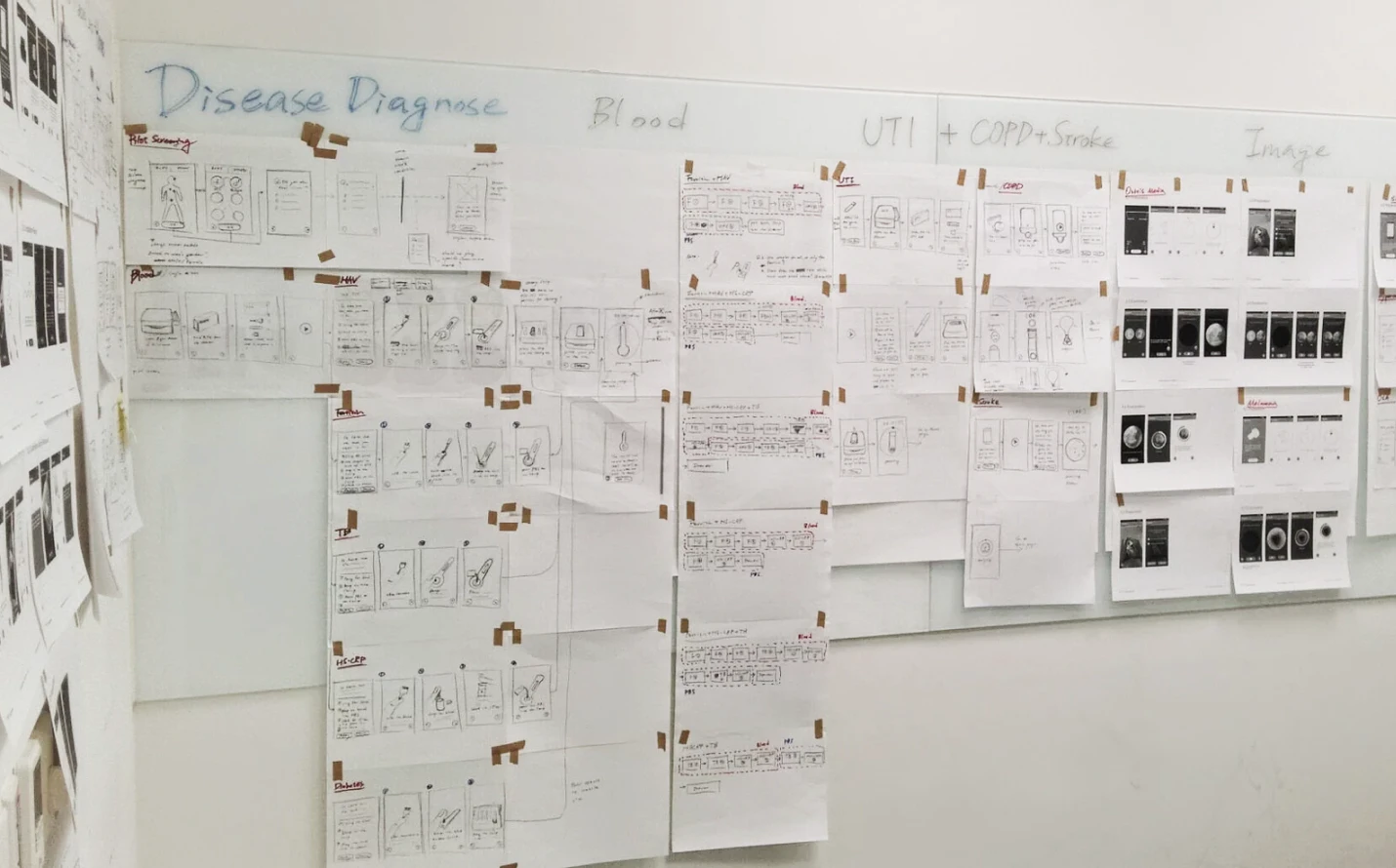
Design
Mapped out the app flows and architecture
As the diagnostic approach stabilized, we mapped out all the diagnostic flows for the 13 conditions and five real-time vital signs monitoring. Since a non-tech savvy user needs to complete a considerable amount of tasks in a given period, we strived to simplify the app structure by reducing layers and using a step-by-step model to minimize the navigation hurdle. We also develop a design language to ensure the experience is consistent across digital and physical.
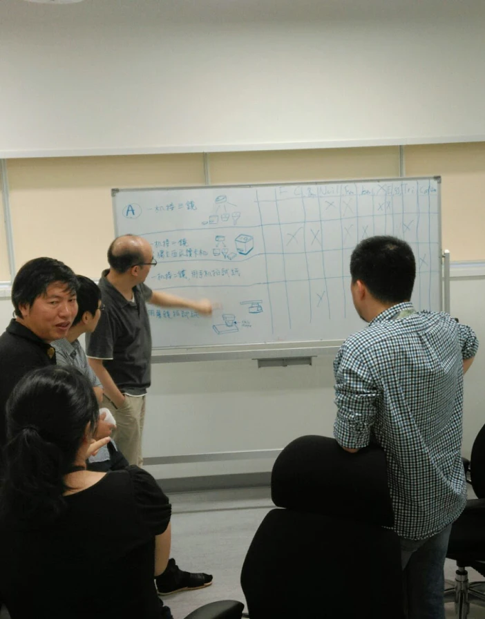
Testing
Iterating toward a delightful and robust experience
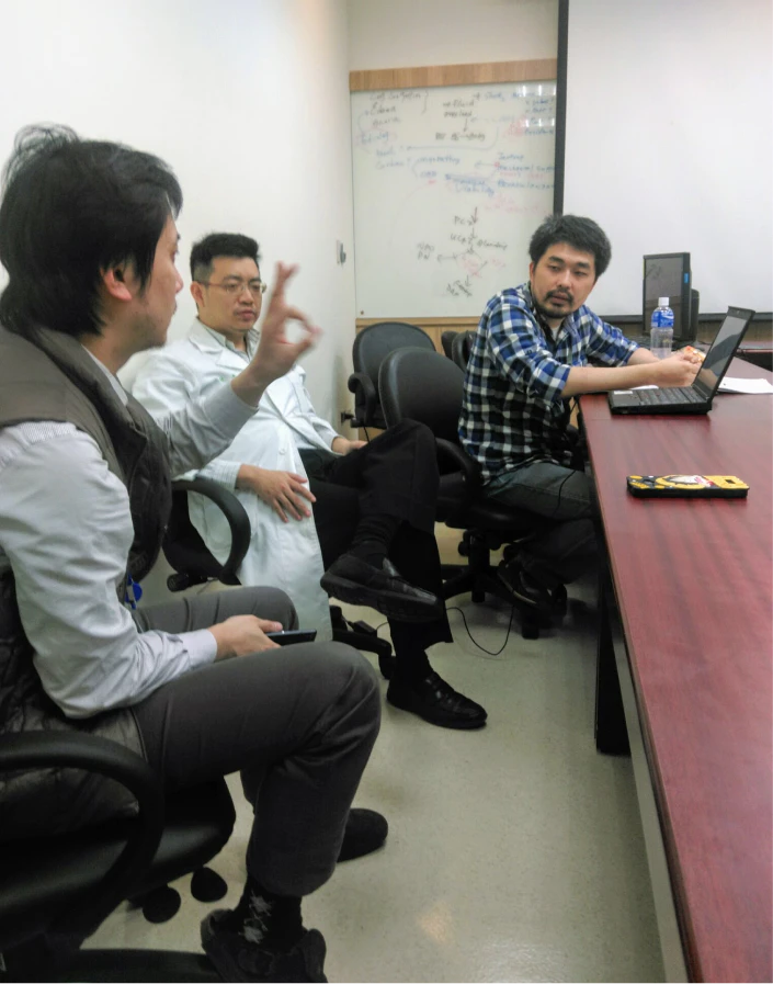
Throughout the design journey, we keep working with QAs, Doctors, and the Xprize crew to validate our assumption in different settings from concept to simple interaction.
Dogfooding
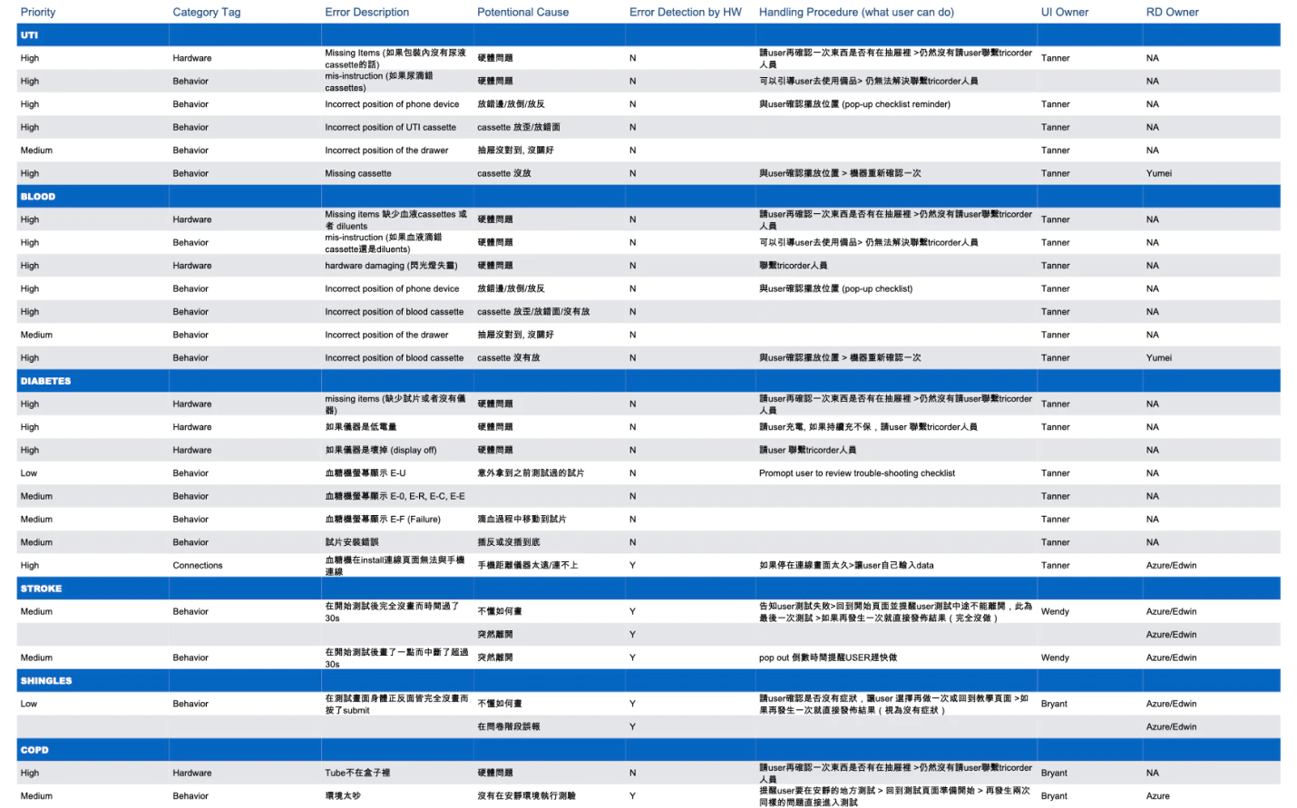
We constantly sent working prototypes for our colleagues to play with it and report issues they encounter. This simple act helps us uncover many bugs and edge cases, such as battery burnout and connection problems, helping us build a much stable and comprehensive system.
IRB Test
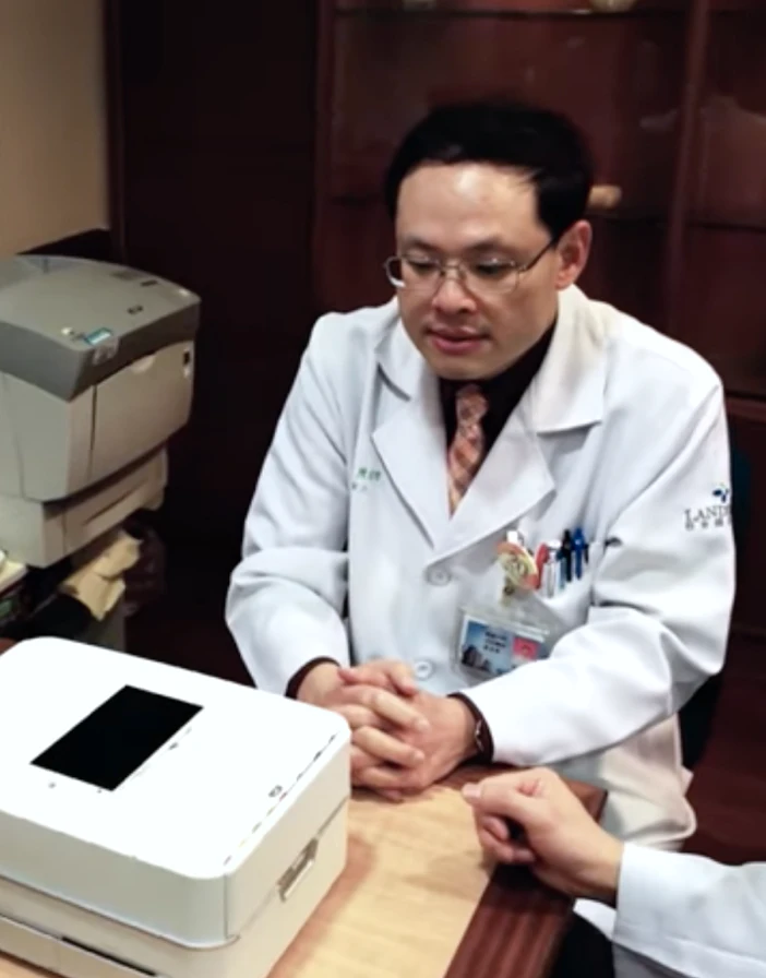
We conducted IRB tests in the clinic for diseases using the new diagnosis method like Shingles and COPD. We invited patients to try the system and compare results with the conventional approach. While the goal was primarily focused on diagnosis accuracy, we also discovered several pain points and design opportunities to improve the experience further.
Testing
Remote User Testing
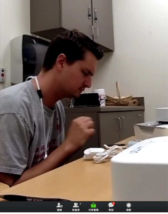
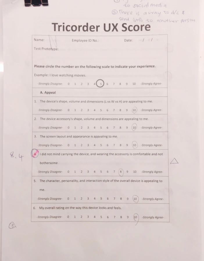
Before submission, the Xprize Foundation offers a chance to test our system and get feedback from five actual users. These people are mixed demographic and have one or more of the 13 target conditions (including the absence of disease). We observed and interviewed the participant remotely. We also analyzed system logs and experience scoresheets to spot the area of improvement for the final design.
Instruction is clear enough for the participant to conduct the test without any helps.
Participants were surprised by the novelty and simplicity of the new test method.
Participants like to see more lifestyle suggestions in health education.