Kickoff
Picking up the context on the go
Since we joined the team halfway with a tight timeline, we started with a quick review of what had been done and where the gaps were. We met the two client teams respectively to clarify their needs and assumptions about the product and consumer while sitting down with the product team to learn about their philosophy, and the newly developed features and design language. In the process, we also learned some hardware limitations that would eventually impact the UI design. The review taught us a few key points that helped us to focus our efforts down the line.
Creating a signature UI that does not disrupt its legacy in the market
Making the interface easy enough for all family members to use the products
Making the visual language timeless and scalable to apply across the portfolio
Design
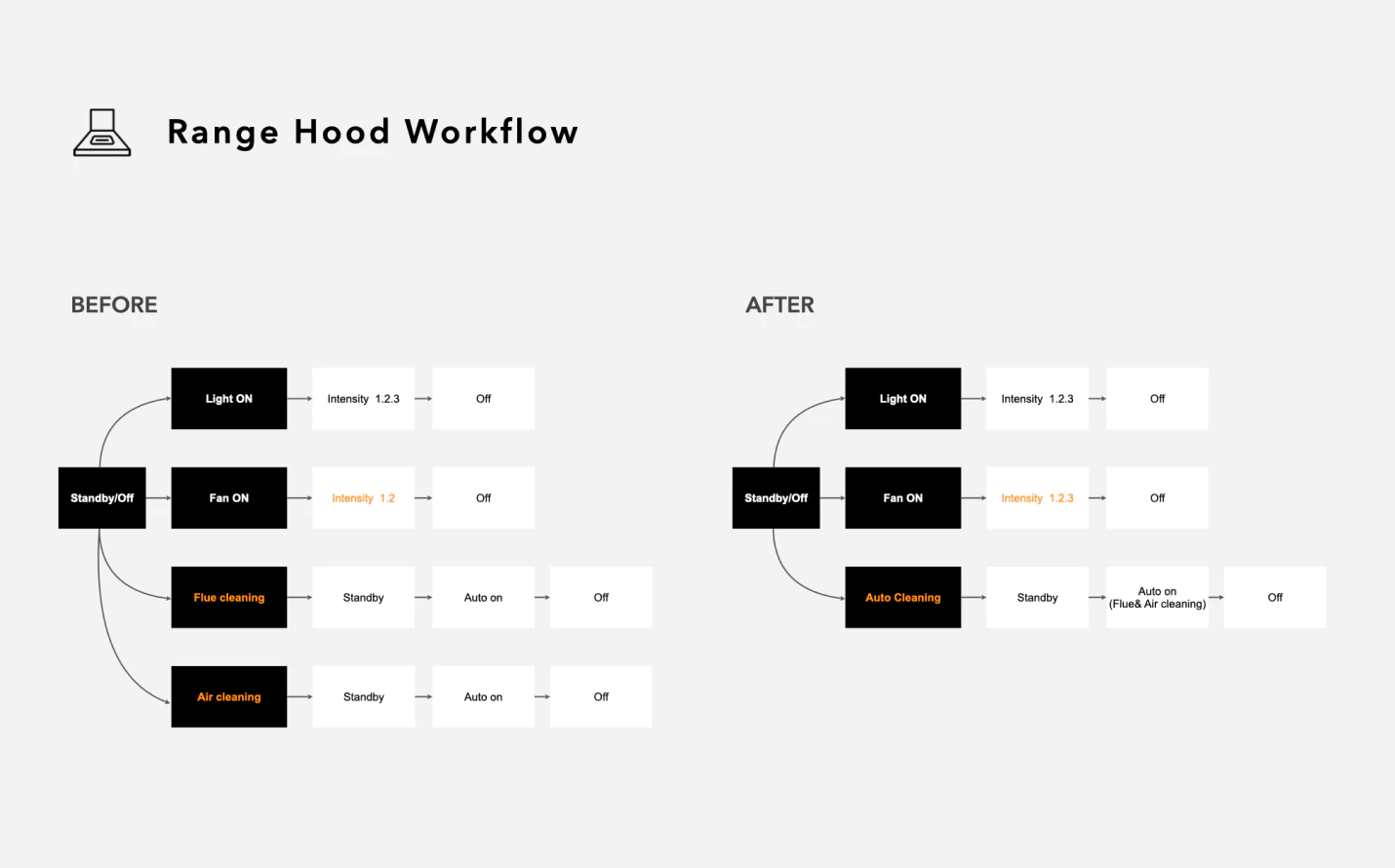
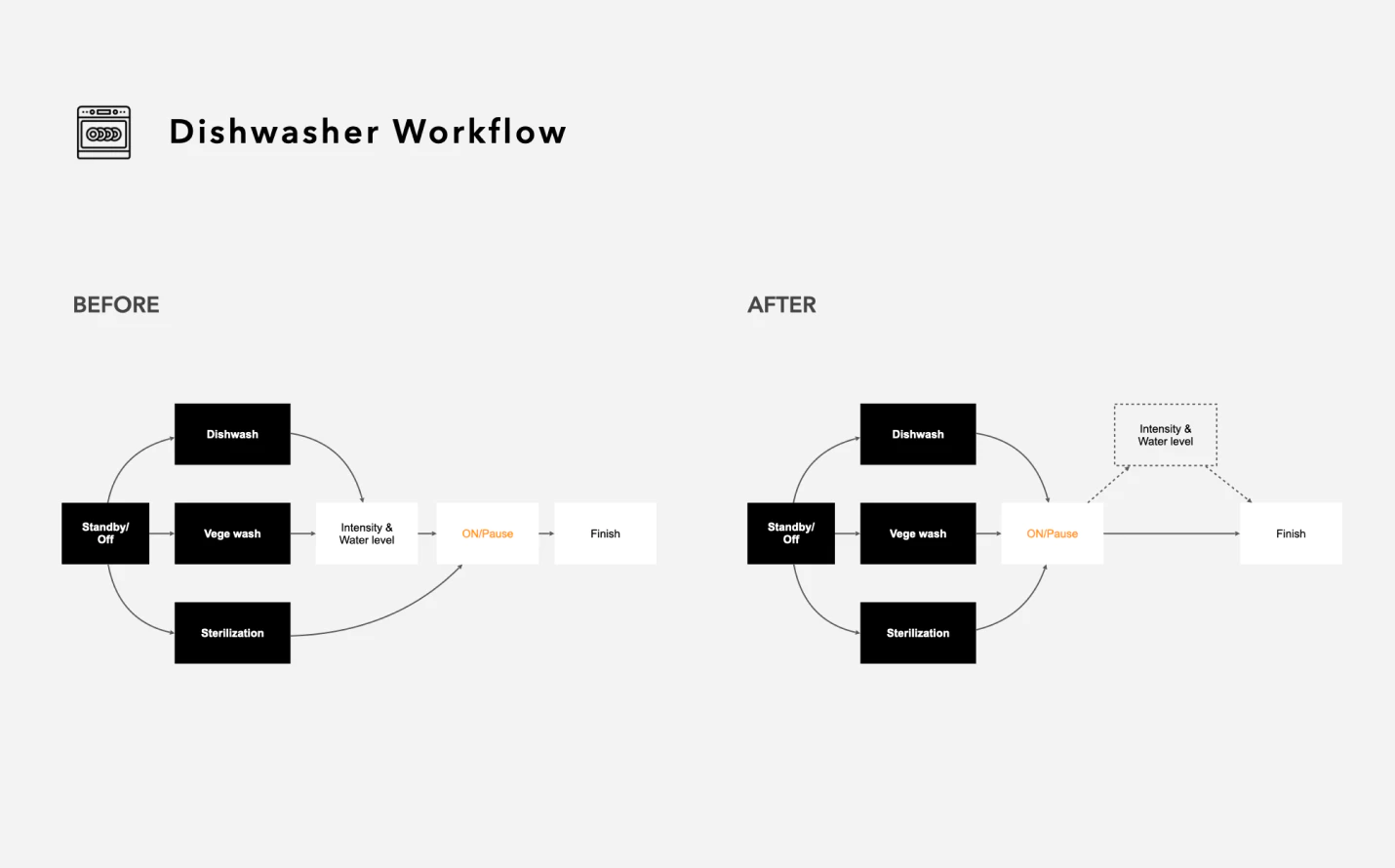
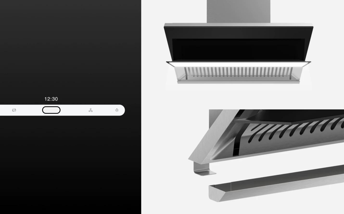
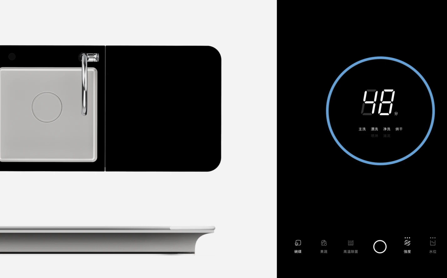
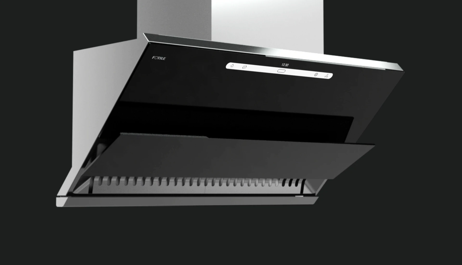
Reconstructing the UI flow
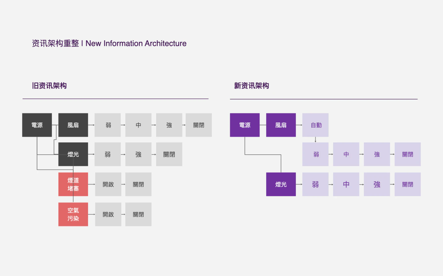
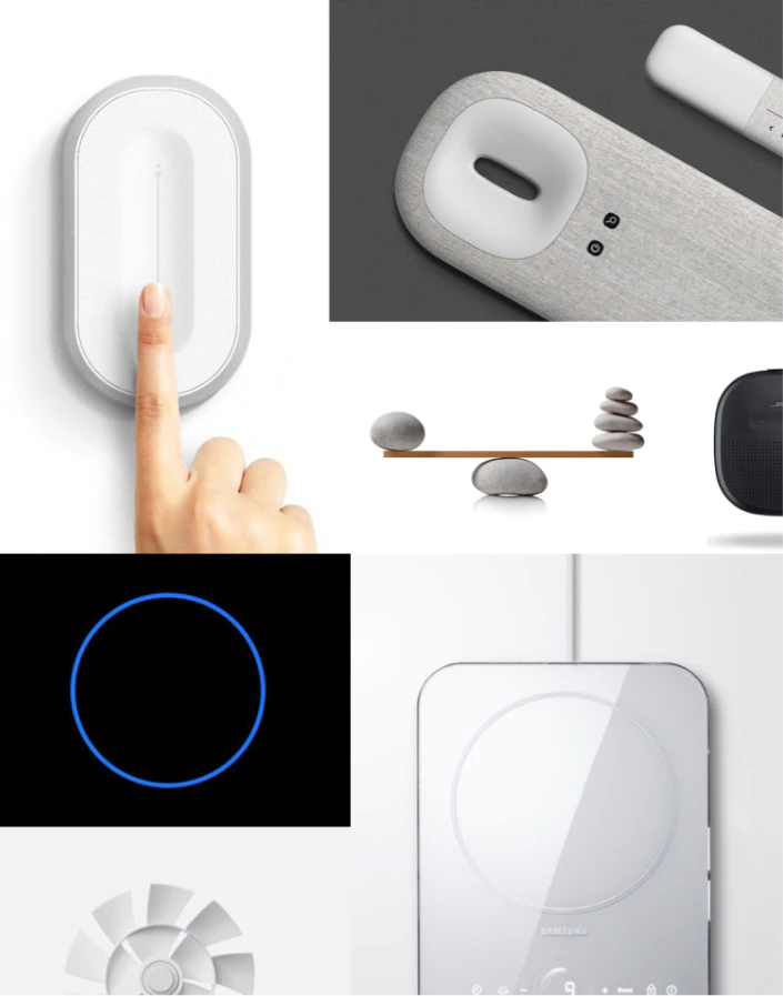
The new UI language was not just the look, but also how it could work smarter to serve its users. Therefore, we first studied the current hood and dishwasher UI to inform ourselves of how the two products worked. Then we broke down all the functions and status, laying out the information architecture and workflow to explore how a user might interact with the product in different contexts. This process helped us to uncover the superfluous parts and missing links of the system, providing opportunities to create a much simpler yet more delightful user flow.
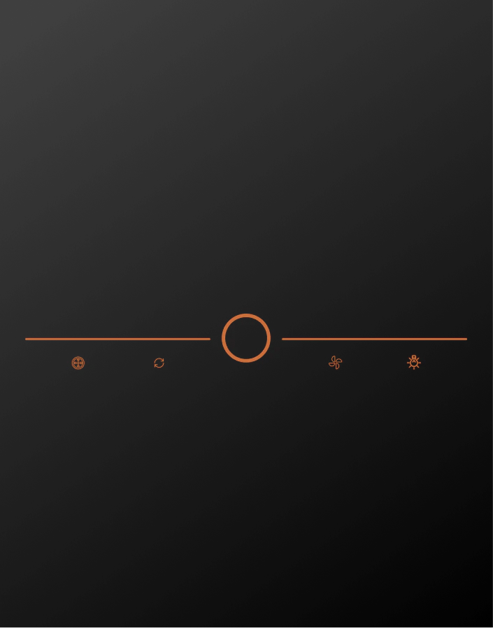
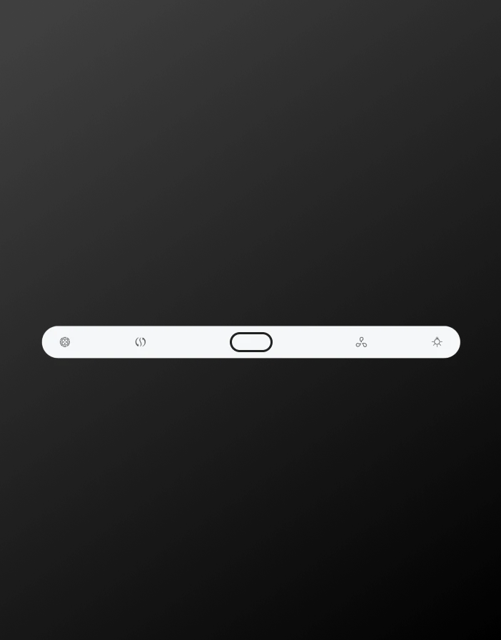
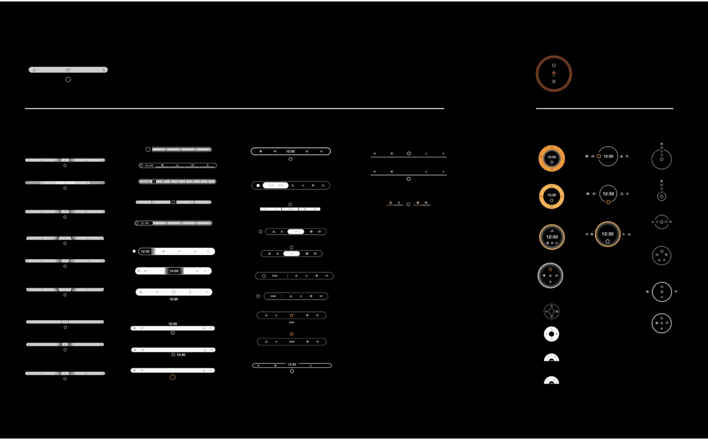
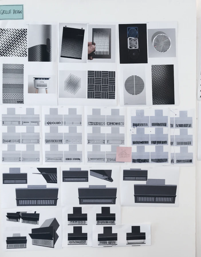
Exploring the signature visual idendity
With the new structure in hand, we now had a foundation to build the new visual language upon. In order to be more generative, we first listed all the visual elements of the two products that we could possibly play with, including the tone of the copy, font, color, icon, layout, motion, sound, and even tactility.
In parallel, we extracted keywords from the product design principle, and expanded the existing mood board to provide broader visual inspiration for both the product and interaction team. This dual effort helped us to quickly explore multiple possibilities without losing sight of our goal, generating three distinct UI proposals for both products which were ready to be tested in the field.
Testing
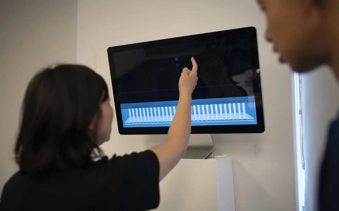
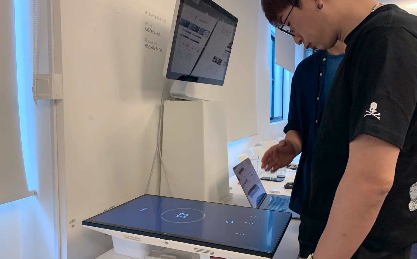
Building prototyping to learn from the consumers
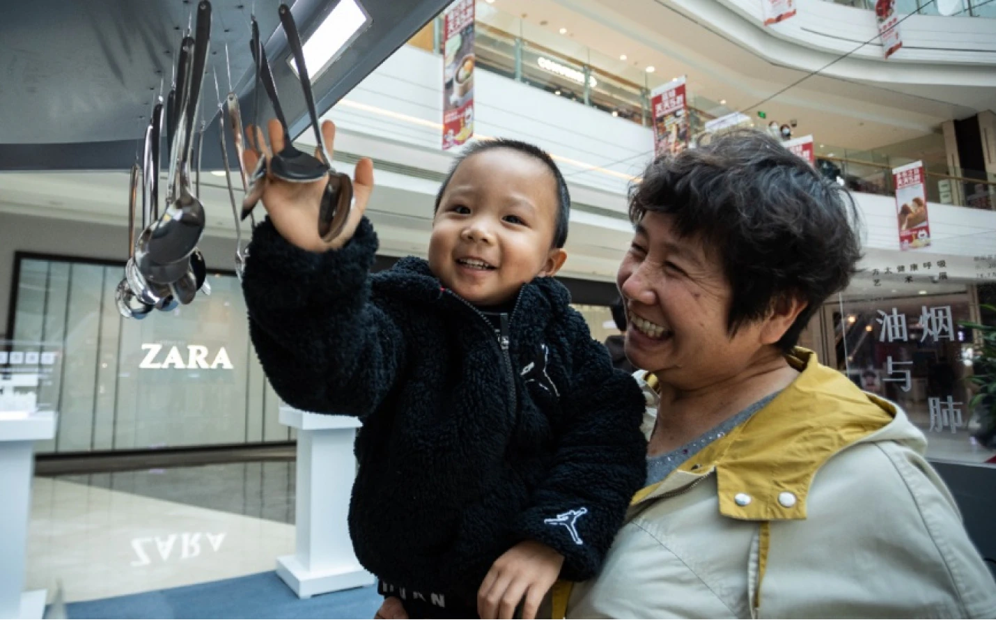
As the time was short, we were eager to see how the consumer might resonate with the new UI proposals. We spent 2 days building real size, hi-fidelity prototypes with ambient sound to mimic the kitchen scenario. Then we recruited 5 participants based on Square's consumer profile who cooked regularly, owned a high-end range hood and dishwasher, and were key decision makers on kitchen appliances. Then we recruited 5 participants based on Square's consumer profile: regular cooks, owners of a high end range hood and dishwasher and key decision makers in purchasing kitchen appliances.
We asked about their ideal brand and the experience of using the hood and dishwasher. We then invited them to try out the prototype while thinking out loud to tell us what was going on in their mind. This result not only helped us to clarify some questions on brand perception and usability, but also inspired the team to think more extensively by uncovering some hidden scenarios that we had not considered, for example, looking from the living room to check if the dishwasher had finished.
People love autosave settings, so they don't need to readjust every time.
People want to know the status from afar so they can better control while multitasking.
Automation is cool, but it should be easy to understand and undo anytime.
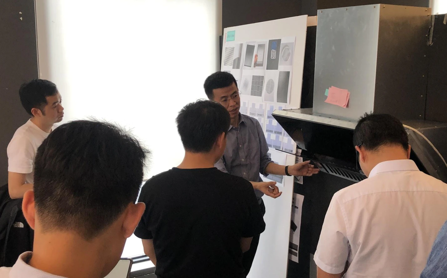
Feasibility check with the client
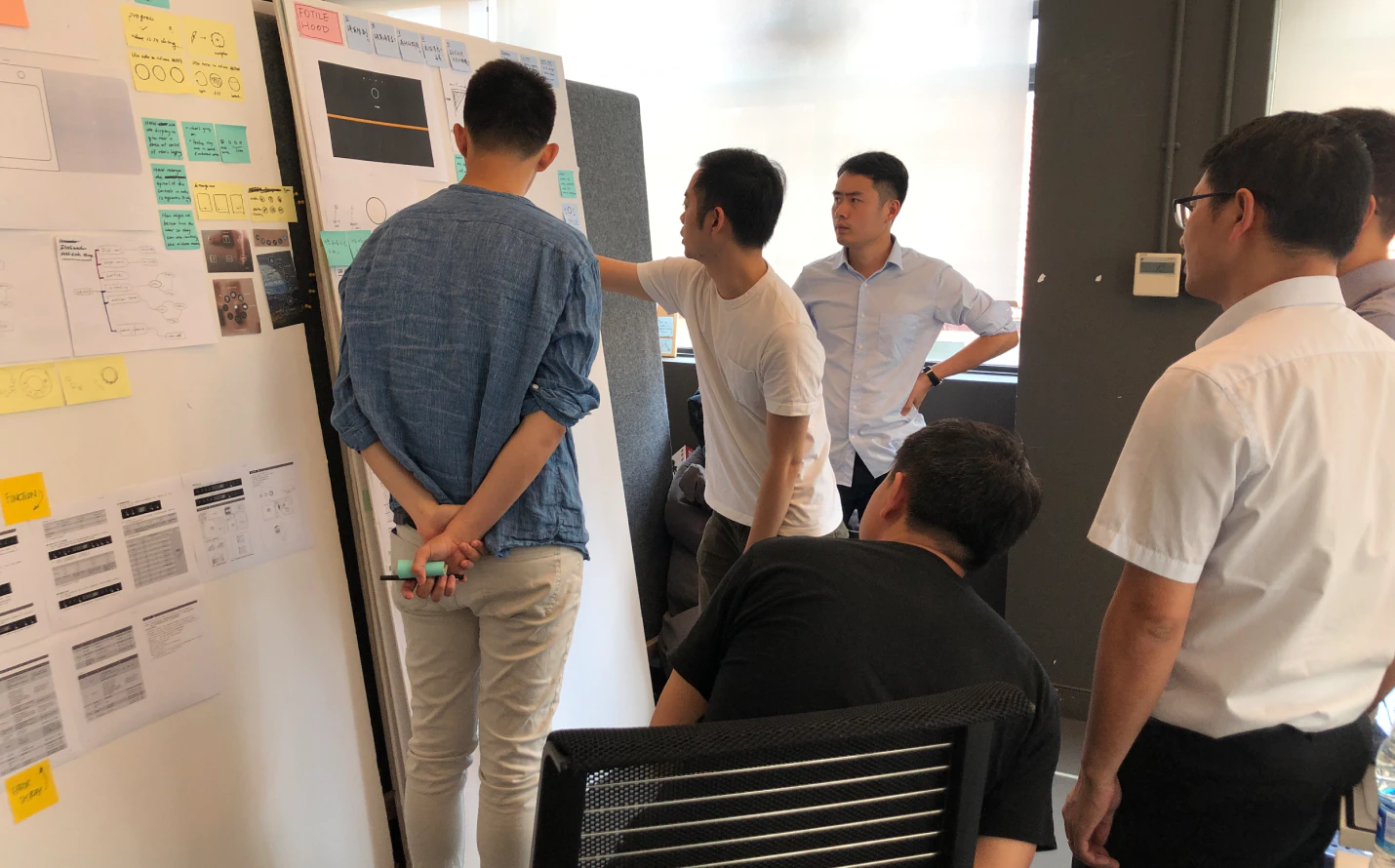
Based on the above findings, we quickly refined the UI prototypes and invited the core members from the range hood and dishwasher design team to the workshops. In the session, we walked them through the three UI proposals and played back the insights from the consumer research. The prototypes helped the Square team to fully grasp the design intent while running a quick assessment of its market value, cost, and feasibility. This enabled us to prioritize the proposals for both range hood and dishwasher, and have a clear view of how to refine the design and push it forward.
Crystallizing the chosen UI direction
While the workshop gave us a clear alignment on which direction to go in, the final UI design remained unresolved since the clients were pushing for a much more iconic design and many technical challenges remained to be settled. To address the issue, we went back to our drawing board, conducting runs of brainstorming sessions with the product team on how to evolve the chosen UI directions.
We came up with over 50 ideas in one day, built them in real size and put them side by side to mimic how an idea might stand out to a consumer in the store. In the meantime, we collaborated with a motion designer to explore how the UI might perform in key functions like switching on/off, button click, operating etc. These efforts helped us to nail down the final solution with the core team and get ready to bring the solutions to the board room.