homotech

A tech brand that speaks Intelligence with Compassion

UX/UI, Braning, Website, Mobile, TV

Homotech is looking beyond it's renewable energy business to becoming a global leader in smart tech for future cities. The question is, How might we expand brand from a wind turbine provider into a tech giant that serves its new consumers?

* Name and photo in this case study have been changed to protect confidentiality.

Challenge

Initially a Chinese B2B wind turbine provider, Homotech is actively expanding its portfolio and global presence in providing solutions of renewable energy and smart technology to its end consumers. However, its weak brand message and positioning were leaving its employees working in silos, confused about where the company was heading. Our challenge was to translate the CEO’s vision, “Intelligence with compassion,” into a compelling story that speaks well of what Homotech is both internally and externally, be it customers, partners, or governments.

My Role

I focus on bringing structure to the brand exploration. I helped translate the visual language into a design system that can apply to various digital products and services.

The glamorous office of Homotech shows its ambitions

Approach

Building emotional alignments from the bottom up

Homotech does not lack strategy or analysis ; what it needs is a strong narrative to connect all business units, and communicate in a way that a consumer can resonate with. Being aware of the dominant deductive culture, we instead leaned heavily on visual and audio exploration to provoke different points of view and sentiment on what the brand could be.

The design started from day one with the brand team when audited key touch points together while building mood boards to dissect what it meant to be “Intelligence with compassion.” We then consolidated ideas into three distinct brand propositions, which were tangible enough to trigger strong feedback and bring alignment among the stakeholders.

Following the chosen direction, we built prototypes in runs of iteration to define the right narrative and market position, deepen the visual expression, and see/envisage how it could scale as a system across all touchpoints. We finally converted the system into a design toolkit to help the Homotech team to realise their vision.

Kickoff

Extract key message from all levels

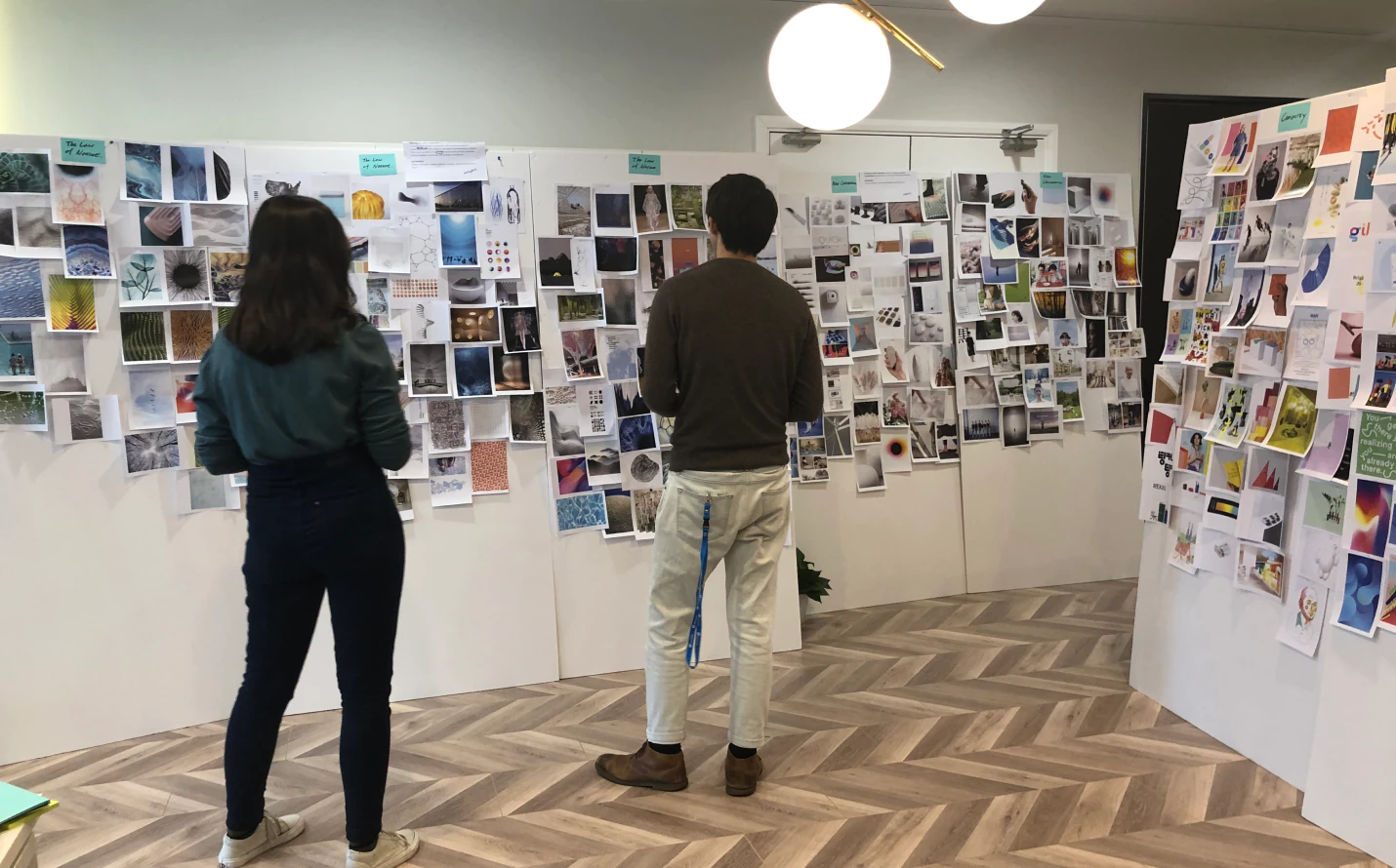
We started by meeting with leaders across business units to hear their assumptions and challenges to be ‘Homotech’ while conducting brand audits with the brand team to understand their business landscape and the key touchpoints to focus on. In parallel, we used the learning we had to expand the words “Intelligence with compassion,” by developing a set of keywords and future scenarios, building mood boards, and various narratives along the way.

We showcased our work every day in the dining area and invited all the employees to share feedback with us. This participatory process allowed us to quickly understand the company from all levels while narrowing down the proposal from nine to three distinct brand propositions - The principle of nature; The new conversation;, and Bold curiosity.

Research

Get alignment on the brand direction

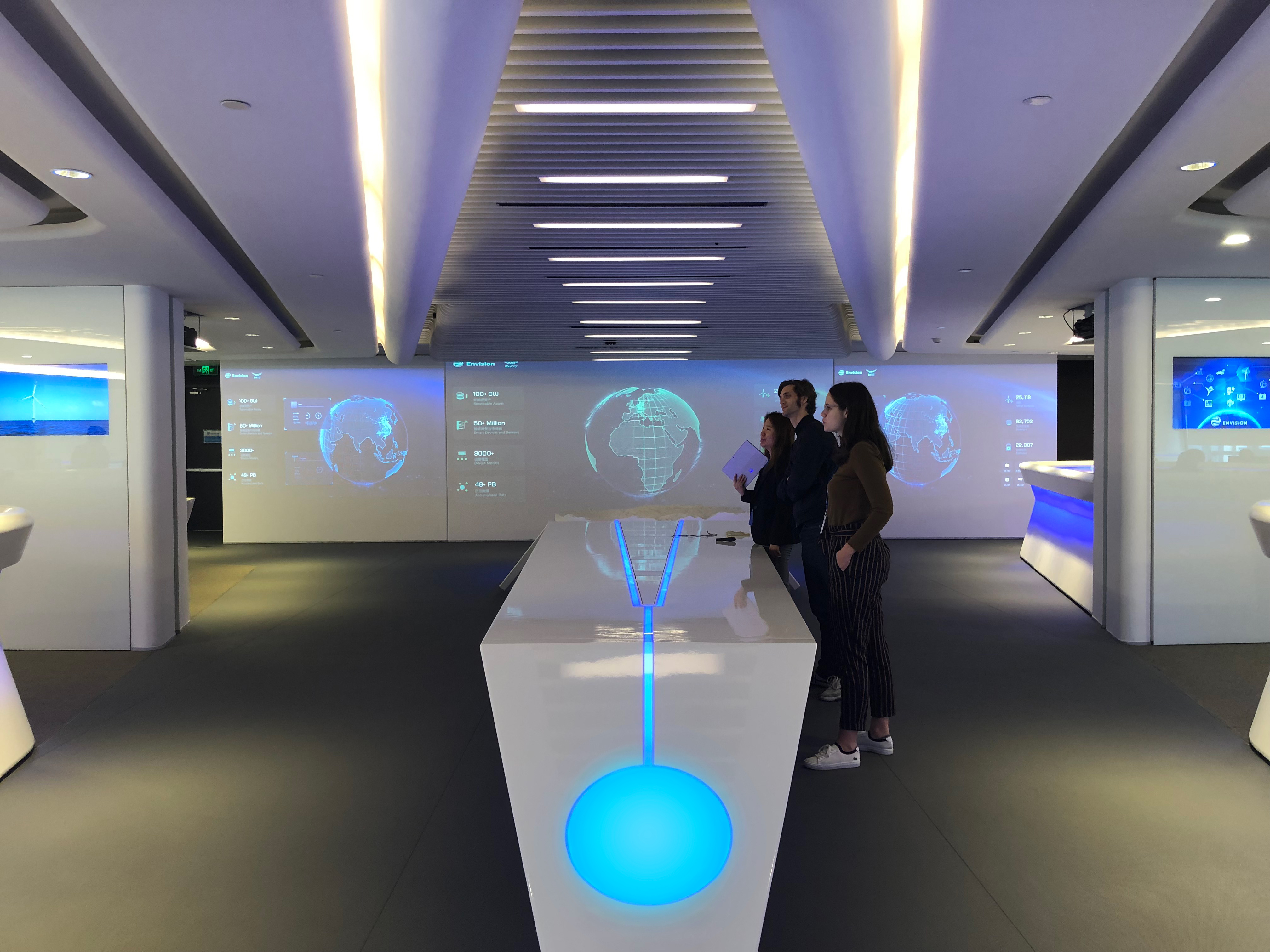
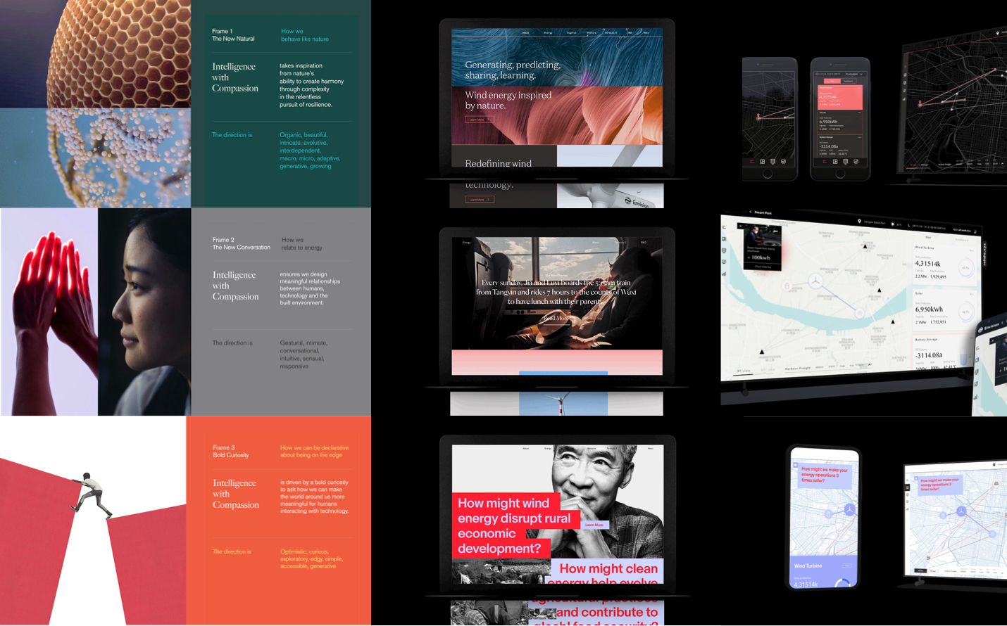
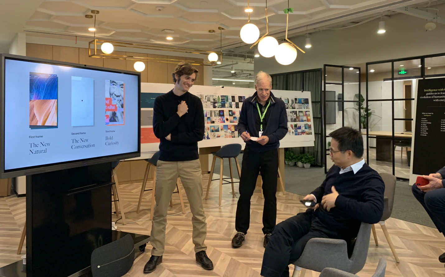
Next, we invited all stakeholders in Homotech, including the CEO, to a workshop, where we shared the three brand proposals in an immersive setting. We used video to tell the brand story, combining with the visual rendering on their major touch points such as the landing page, product, and data dashboard. This rich visual expression provoked a strong sentiment among the group, helping us to drive the conversation deep into which direction to go and how it could evolve to support Homotech’s future strategy . It iwas clear that everyone appreciated the beauty and intricacy of the first direction - the Principle of Nature, but also felt it needed more human qualities, to show the care that Homotech wanted to bring to the world.

The brand language should symbolize an energy company.

Highlight the emotion and humanist side of technology.

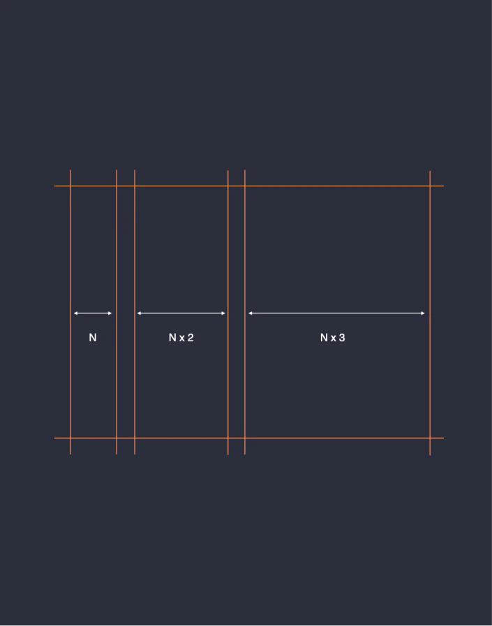
The brand system can scale across different product portfolio.

Design

Defining brand narrative and positioning

With clear feedback from the workshop, we then dived deep into the brand narrative and how it could be differentiated from other tech players. To do that, we first studied the top tech brands across new ventures, startups, and enterprises in both Chinese and global markets to Understand what the story they were telling was, and more importantly, how they delivered it to the audience. To process it more systematically, I created a framework to hold all the evidence we found to see how the storytelling format evolved at the company scale, and how its portfolio had grown . This study not only helped us draw inspiration from those successful players but also informed us how we should position Homotech for the present and future as the company evolves.

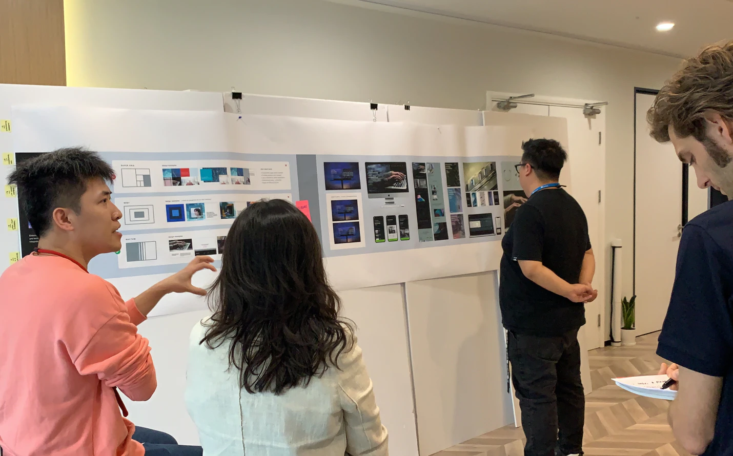
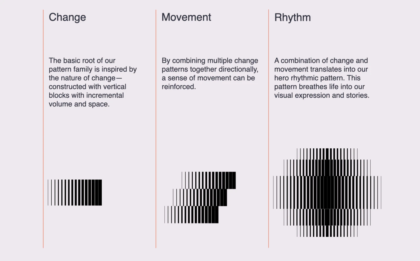
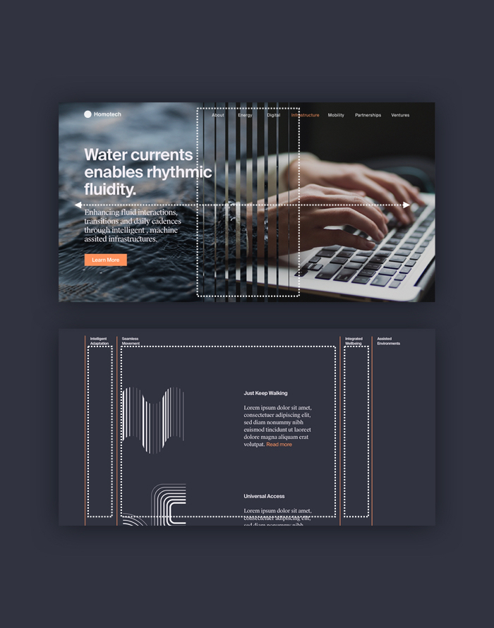
Finding the visual expression that clicks

As we developed the brand narrative, we kept experimenting with what the visual language might be to best express the message. The exploration became two-fold. On the one hand, we kept writing slogans and mini-stories to extract the core elements from the narrative and used /using that to evolve the mood board to find the right look and feel for what the story was delivering. On the other hand, we used these visual elements to build and test the visual expression on the key touchpoints. This dual exploration helped us to explore multiple possibilities while keeping our ideas grounded. After countless iterations, we finally landed on a sweet spot with the brand team - a visual system that spokes elegant, constant movements, and smooth transitions.

Testing

Put the brand system in scale

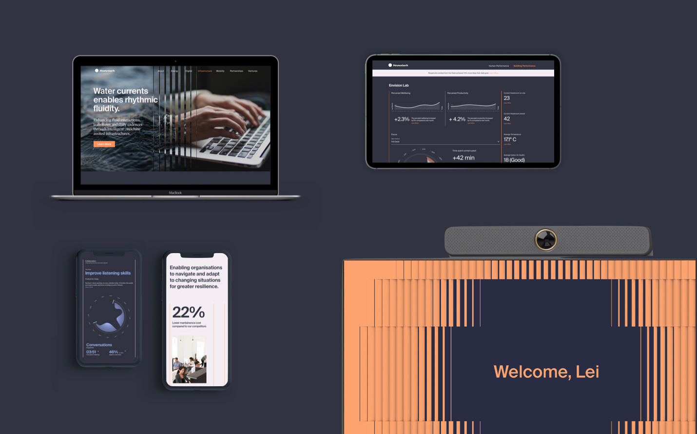
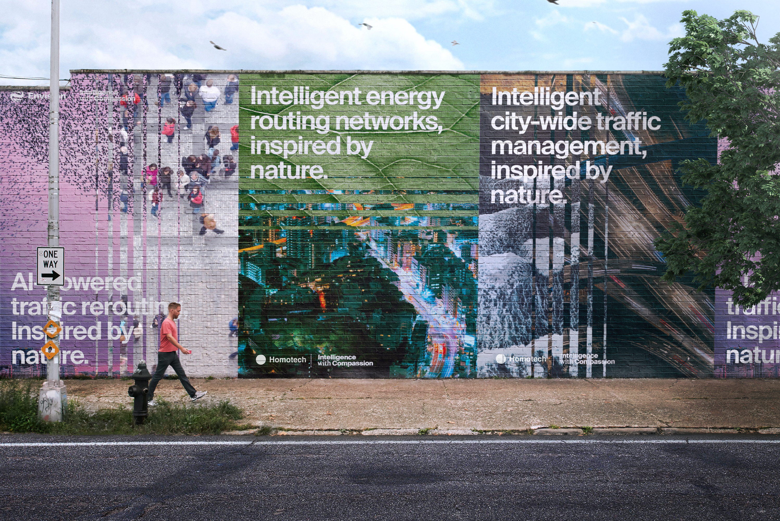
The final step was to make sure the brand system could scale and work across products and services in Homotech, as the company was expecting to expand its portfolio in the coming years. Since digital would l play a significant role in their future portfolio, I worked closely with our visual lead to apply the brand system extensively on every digital component we could imagine - the enterprise website, the EnOS Dashboard, the smart building app, the mobile charger interface, or even the employee's smart badge. To further test the system, we invited our partner team, who were working on the client’s smart building project, to adopt our brand system in their work. This rigorous process helped us to foresee any potential gaps and fill them before we handed it to the brand team.

“I already seeing myself leading the team to implement this brand language.”

Zha Fang

Brand lead of Homotech

Outcome

The work was a hit both externally and internally. Since we delivered the project, the brand team has started using the content to facilitate discussion in the organization. It not only helped to spark some passive members of the leadership to actively share their thoughts within the group, but also deepened the trust and /encourage/ created brought more collaboration from the skeptical CEO. While we haven’t seen the brand launch due to its longer development term, Iit does set a benchmark for the studio’s future brand work.

Final design

A flexible design system is created that inspired by how nature behaves. It’s designed to acknowledge technology and built to tell Homotech’s stories of the future. We shared our works with all key stakeholders across different business units, using video and applications to illustrate how ‘intelligence with compassion’ can be used to deliver the brand’s value in our everyday life. The work sparked positive energy across the room, bringing discussion on how Homotech could bring this new brand system to life.

  • 01. Motion Based System
  • 02 The Human Touch
  • 03 Build for Digital

01

Motion based system

Inspired by Nature

Like nature, we see changes in tech as as positive progress and opportunity. The motion-led system is designed for the 21st century where animated screens are the predominant medium. It enable the communication to be more dynamic and alive.

Juxtaposition to Connect

Connected imagery/ video in juxtaposition is a key visual treatment in our messaging system. The visual resonance the symbiotic relationship between the Homotech’s two core pillars - nature and technology.

Rhythmic Patterns

The rhythmic pattern establishes fluid connection and visual vibration in still images. It is a flexible, living device that scale our stories across variety of content and mediums.

02

The Human Touch

Audio for Intimacy

We add audio on signature touch points to enhance the concept of Intelligence with Compassion. Using minimal yet experimental piano notes to evokes sense of intimacy.

Optimistic Color

We created a warm, honest and optimistic color palette to help Homotech to communicate across channels and contexts, showcasing inspiration, delivering purpose, and highlighting product and service of different business units.

Authentic Imagery

We showing people in close-ups and mise en scène scene setting. Bring people right into a moment of authentic human connection. We visualize data in legible and sophisticated manner. Use color and mataphor to bring it to life in points of emphasis.

03

Build for Digital

Grid and Module

Homotech is keep expanding its digital portfolios. We buid the brand system wirh grid and modulize elements. Making it more adaptive to different mediums and content while keep high consistentcy in scale and speed.

Blend with Enviroment

Since nature is our inspiration, we want to highlights ideas without disrupte the enviroment. We strive to blend every message with its surrounding, using the unique context as advantages to enhance the communication.

Reflection

Using alternative approaches can help the team to shine new lights on old problem and overcome blind spots.

Seek opportunities to connect different works with same client. It puts ideas in a better position to be realized.

Quick design jams is good for exploration. It forster ideas exchange and brings unexpected breakthroughs.

Similar case studies